• Skip to primary navigation
  • Skip to main content
pragati logo

Pragati Tech Services

  • Home
  • About
  • Services
    • Ecommerce Solutions
    • Customer Happiness
  • Blog
  • Contact
  • Show Search
Hide Search
You are here: Home / Archives for Opinion

Opinion

2 UX Tips to Bubbly

Sachin · September 26, 2013 ·

Bubbly is a voice based social network so instead of typing on your phone, you can record your voice and post it to share with rest of the world. Interestingly celebrities like Amitabh Bacchan, Priyanka Chopra, Salman Khan etc are using it so fans now have a great option to connect with them on a more personal level. You can also apply filters and effects to your voice before posting which is really cool. They already have more than 30 million users. Tech Crunch has a good article on them saying how they started as Twitter for Voice and later morphed into Instagram of Voice.

I was just playing with Bubbly iOS App and it occurred to me that they can make 2 simple changes to make user-experience even better so I am sharing my thoughts here:

1. Continuous Playback when navigating app

Now my biggest issue with the app is that voice playback stops if I navigate away to a different screen. Sometime I tap on a user and navigate to his feed while listening to voice post of another user. When I do that playback just stops suddenly. Even an accidental tap which takes you a different screen will stop playback. Now this is not a very pleasant experience and I think playback should continue until I stop it or it is done playing or I start listening to another post.

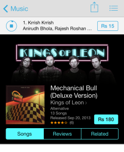
iTunes store app already has a good solution for it. As you can see in the image below, I am listening to a song while browsing another album. Current song is simply moved to top bar and rest of the screen shows the screen I navigated to. Something along these lines will be very helpful in Bubbly app as well.

2. Pause option (May be even reverse/forward)

I would really love to jump to a certain playback position sometimes or may be go back a few seconds/minutes in playback at times. Also this will be really helpful in absence of continuous playback as suggested above. So even if I navigate away to a new screen, I can atleast comeback and don’t need to listen to same post from the beginning and can just jump to the section I haven’t listened already. May be I can just swipe along the playback circle to control this?

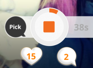
Also maybe the current stop button can be converted into a pause button instead? And may be even multiple posts can remain paused and I can choose to resume playing whichever I want, whenever I want?

So these were my 2 cents aka 2 tips 🙂

However I would also like to point out that I really like the UI of the app, their pull-down-to-refresh animation is really cool and these are just 2 things which I would like to see improved, other than that I find their UI very innovative and usable.

I would like to leave you by sharing an interesting fact about Bubbly which is, it is headquartered in Singapore and CEO Thomas Clayton recently shared how he created a Silicon Valley caliber team in Asia and I think he was quite successful in doing that and their CTO Justin Mann is one proof of that.

2 Shopping Tips for LinkedIn

Sachin · June 2, 2013 ·

I wrote a blog post some days back praising LinkedIn iPhone App’s use of smartphone capabilities, however there is one thing clearly missing in the App and that is, support for location sharing. I see immense use of using location in the App.

What if you can automatically come to know about one of your LinkedIn connections visit to your city or what if you are in some conference and you can see and connect with other LinkedIn users from the app itself? Sounds interesting right? I am not sure if its a conscious decision by LinkedIn to not use location in their app, but I don’t see any reason why they shouldn’t support it. Obviously there may be some privacy and security concerns but users can be allowed to opt-out if they want to. As long as users can control their location sharing, there should not be any issue.

Thankfully if you want to use location with your LinkedIn account there is an App for that and the App is called Here on Biz and is available for free on AppStore. So my first tip for LinkedIn is that it should buy ‘Here on Biz’ and integrate all its features in the official LinkedIn App. Here on Biz on its own may not get as much traction, not everybody will install it or know about it, but if these facilities are available in the official app, everybody will be able to use it. ‘Here on Biz’ has just launched another great feature in their app and it’s called ‘Influencer of the Month’ where they highlight one high-profile business leader each month and users of the app can get a coffee date with that person. Read more about it here.

One specific need most of the founders have is need to find a suitable Co-Founder. What if they can search for a co-founder on LinkedIn? I know one can always browse through their connections to find a suitable co-founder or maybe even use LinkedIn’s Job section for it. But we all know finding a co-founder is not as straightforward as hiring somebody so Jobs section is not really much useful. There is clearly a need to fill this void and one company is making an attempt to do just that, the company is called Founder2Be and as par their own admission “Founder2be is like Match.com meets LinkedIn for entrepreneurs”. So my second tip for LinkedIn is that it should buy Founder2Be and make searching for a co-founder available as an independent section on their website.

It’s entirely LinkedIn’s decision to buy these companies or not, all I am saying is that I would love to have these 2 features in LinkedIn. Also I respect both ‘Here on Biz’ and ‘Founder2Be’ for their innovative offerings and wish them both all the luck in future. It’s not my intention to offend them by suggesting them as potential acquisition targets to LinkedIn.

Thanks for reading.

Do you need a START button on Windows Mobile?

Sachin · April 3, 2008 ·

Windows 7 Logo

Windows Mobile 6.1 is just released and it has some nice interface tweaks and supposed to be more stable and faster than windows mobile 6. Its a great mobile OS due to its familiarity and compatibility with Windows for desktop. However Microsoft has never given much thought to user experience I guess.

I understand that windows mobile resembles windows in many ways and that probably makes adaptation easier but it probably goes too far with windows resemblance that it ends up being a non-userfriendly mobile OS.

I fully agree with Kevin Hoffman that Windows Mobile is a shrunken and crippled version of windows. I don’t see any value of a Start button on a Mobile OS. I have a few suggestions for Windows Mobile User-Experience team:

  1. Please remove the Start Button, its not needed.
  2. Show big, finger-friendly icons for various applications right on Home screen.
  3. Reduce number of screens and taps required to do various things.
  4. Please do away with tiny text labels and other little user interface elements wherever possible.

I think MS can borrow ideas from Palm, Symbian and other mobile OS. All of them seem to adhere to more or less same user-interface concepts.

Has Microsoft got it’s Mobile strategy wrong???

Sachin · November 26, 2007 ·

Wrong Way Sign

We are a Microsoft shop primarily and we do mobile applications targeting Windows Mobile OS, and we may continue to be a Microsoft technologies company in future too owing to mass popularity Microsoft manages to acquire due to various reasons.

However I simply hate the fact that MS keeps adding layers and layers of complication to all its products, making softwares bloated, complicated, frustrating and slow. There has been enough bashing of Windows Vista as well as Windows Mobile 6. I have read them and been silent all this while, however when I read about Side-Show making its way to windows mobile, I simply could not resist writing this post.

Mobiles are meant to start immediately on press of power button, while desktops are not, so I don’t think side-show is a requirement on mobiles at all. You can just push the power-on button on mobile and press a pre-assigned key to start your favourite application. Why you need an always on and smaller display for it???

I think MS has got its strategy wrong here. Its again trying to make mobiles do whatever a desktop can, which I think is not a clever idea.

Also I guess that in future MS will use Sideshow as an excuse for slow windows mobile powered phones. With all the features it is putting in windows mobile, its going to gradually become slower and slower even with faster processors, so MS will say — use Side-show for features which you want to perform immediately 😉

I think Side-show adds another layer to complicated user-interface and makes users much more confused. In my opinion its a very bad idea.

IMHO MS should instead try to make windows mobile interface simpler, faster and easier to use. I still love the simplicity and performance of Palm OS. I know Palm OS is loosing its ground to Windows Mobile but we need to give the credit for what it offers.

Pragati Tech Services

Copyright © 2023